Design Canvas
Lay out screens and graphics in Frames, and reuse Components, Styles and Variables across a team's files.
A Design file holds Pages on an infinite canvas. Frames, shapes, Pen paths, text and images are Layers, arranged by hand or with constraints and Auto Layout. Components, Styles and Variables keep repeated parts the same, and a Library shares them with the team's other Design files.
Get started free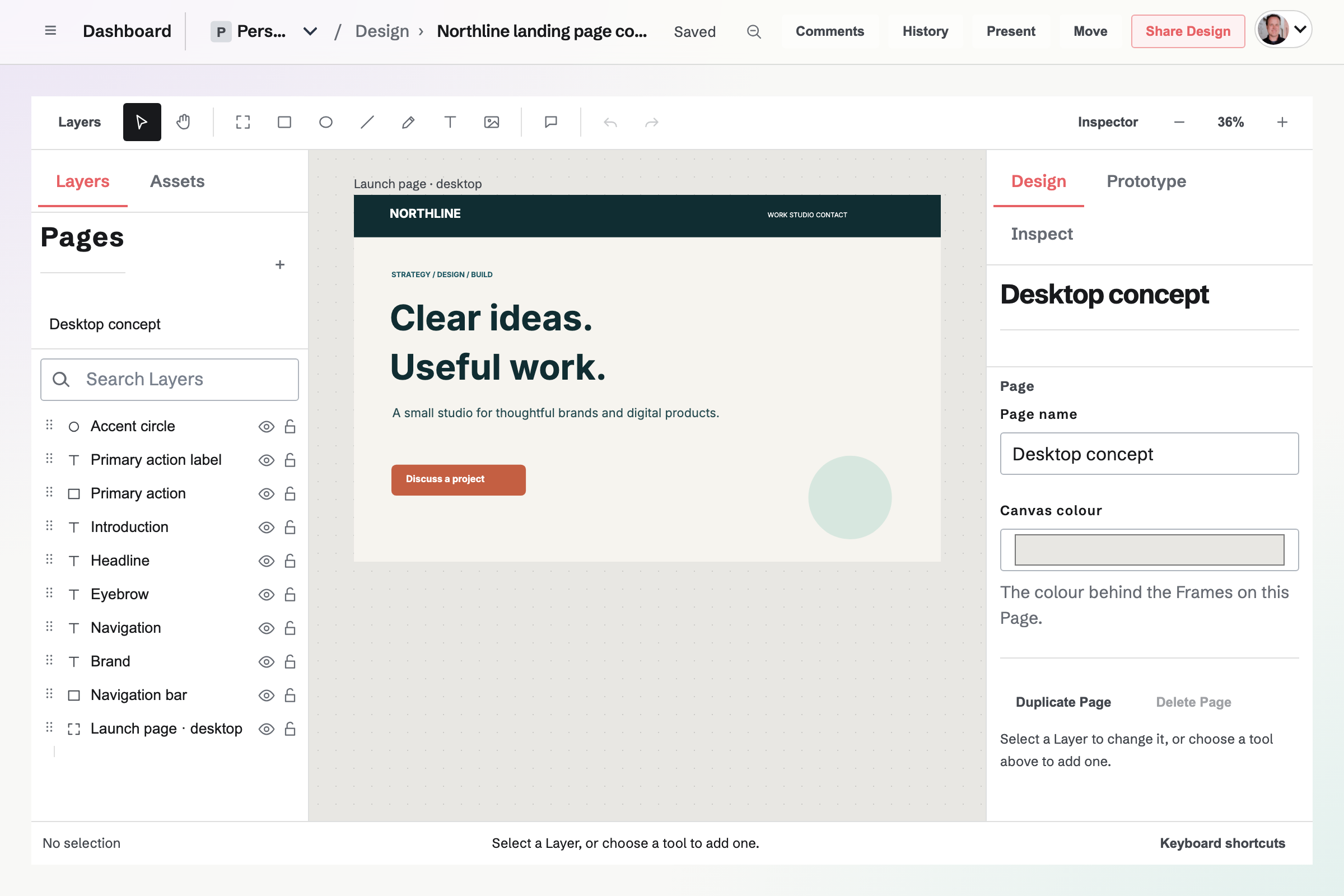
Design files, Pages and starters
Each Design file is in Personal or one team, and its changes are saved as you work.
- Blank Design
- Pick a Frame size such as Phone, Tablet, Desktop, Slide 16:9 or A4 page, or drag on the canvas to draw a Frame of any size.
- Starters
- Layouts grouped as Social media, Print, Work, and Screens and wireframes, from posts and flyers to a résumé and a dashboard wireframe. Every word is a Text Layer, and empty image areas fill from Your images or an upload.
- Team starters
- A team administrator can turn on Team starter for a file, and everyone in the team can then start from a copy of it.
- Pages
- Pages share the file's Components, Styles and Variables, and each has its own Layers, guides and canvas colour.
- Import JSON
- Creates a Design file from a layout written in Magpie's JSON format.
Layers, shapes, vectors and images
Every object on the canvas is a Layer, listed front to back in the Layers panel, where it can be hidden, locked, reordered, or moved into a Frame or Group.
- Frames and Groups
- A Frame is a sized container with its own fill that clips its contents unless you turn that off. A Group holds Layers together without a shape.
- Shapes and the Pen
- Rectangle, Ellipse and Line draw shapes. The Pen draws paths of corner and curved points, and a path's anchors and handles can be dragged afterwards.
- Combine
- Union, Subtract, Intersect, Exclude overlap and Use as mask keep their source Layers editable. Flatten to one Vector joins compatible shapes into one path.
- Images
- Choose a picture from Your images, upload one, or paste or drop it on the canvas. New pictures are added to Your images, which count toward the plan's file storage.
Text, fills, strokes and effects
- Text
- Font, weight, size, line height, letter spacing and alignment, with bold, italic, underline and strike for selected characters. Auto width, Auto height or Fixed sets how a Text Layer grows with its text.
- Fonts
- Common Google Fonts, such as Inter and Playfair Display, which load for everyone who opens the file or its Prototype, and fonts installed on most computers.
- Fill, stroke and corners
- A solid colour or a linear or radial gradient; a solid, dashed or dotted stroke; and one corner radius, or a different one for each corner.
- Effects
- Drop shadows, inner shadows and blur, with the Layer's opacity and blend mode.
Alignment, constraints and Auto Layout
A dragged Layer snaps to the edges and centres of nearby Layers and to guides pulled from the rulers. Align and Distribute line up and space a selection.
- Constraints
- When its parent is resized, a Layer stays pinned to one or both edges, stays centred, or scales.
- Auto Layout
- Arranges the children of a Frame or Component in a row, a column, a wrapping row or a grid, with padding, gaps and alignment, and reflows them as text and sizes change.
- Child sizing
- Each child is Fixed, Hug contents or Fill container in each direction, with minimum and maximum sizes.
- Grid tracks
- Written as in CSS, such as 120px 2fr 1fr, and a child can span several cells.
Components, Instances and Variants
Create Component turns a Frame or Layer into a main Component. Insert places an Instance from Assets, and Update on an Instance brings in later changes.
- Component properties
- A Layer's text, visibility, fill or opacity, exposed under a name and changed on each Instance in the Inspector.
- Overrides
- Text, visibility, fill, opacity, font and text size changed inside an Instance are kept when it updates, until you choose Reset overrides.
- Variants
- Add variant saves the main Component's current fill, stroke, corners and opacity as a Variant, such as a button's hover colour, for an Instance to show.
- Detach
- Turns an Instance into ordinary Layers that no longer follow the Component.
Styles, Variables and team Libraries
- Styles
- A Style saves a Layer's fill, stroke, corners, opacity and text formatting. Update changes every Layer that uses it.
- Variables
- Color, Number, Text and Boolean values in Collections, bound to fills, strokes, opacity, corner radius, text size, Auto Layout gaps and padding, text, or visibility. Code name records the name developers use.
- Modes
- A Collection's modes, such as light and dark, give each Variable a value per mode. Changing the current mode updates the bound Layers, and a Prototype can switch modes.
- Libraries
- A team administrator publishes a file's Components, Styles and Variables as a Library, in numbered versions with release notes. Anyone who can edit a file in the team can enable it in that file, and a newer version will not change the file until someone chooses Update.
Start a Design file.
Create a Magpie account, open Design Canvas, and choose a starter or Blank Design.